
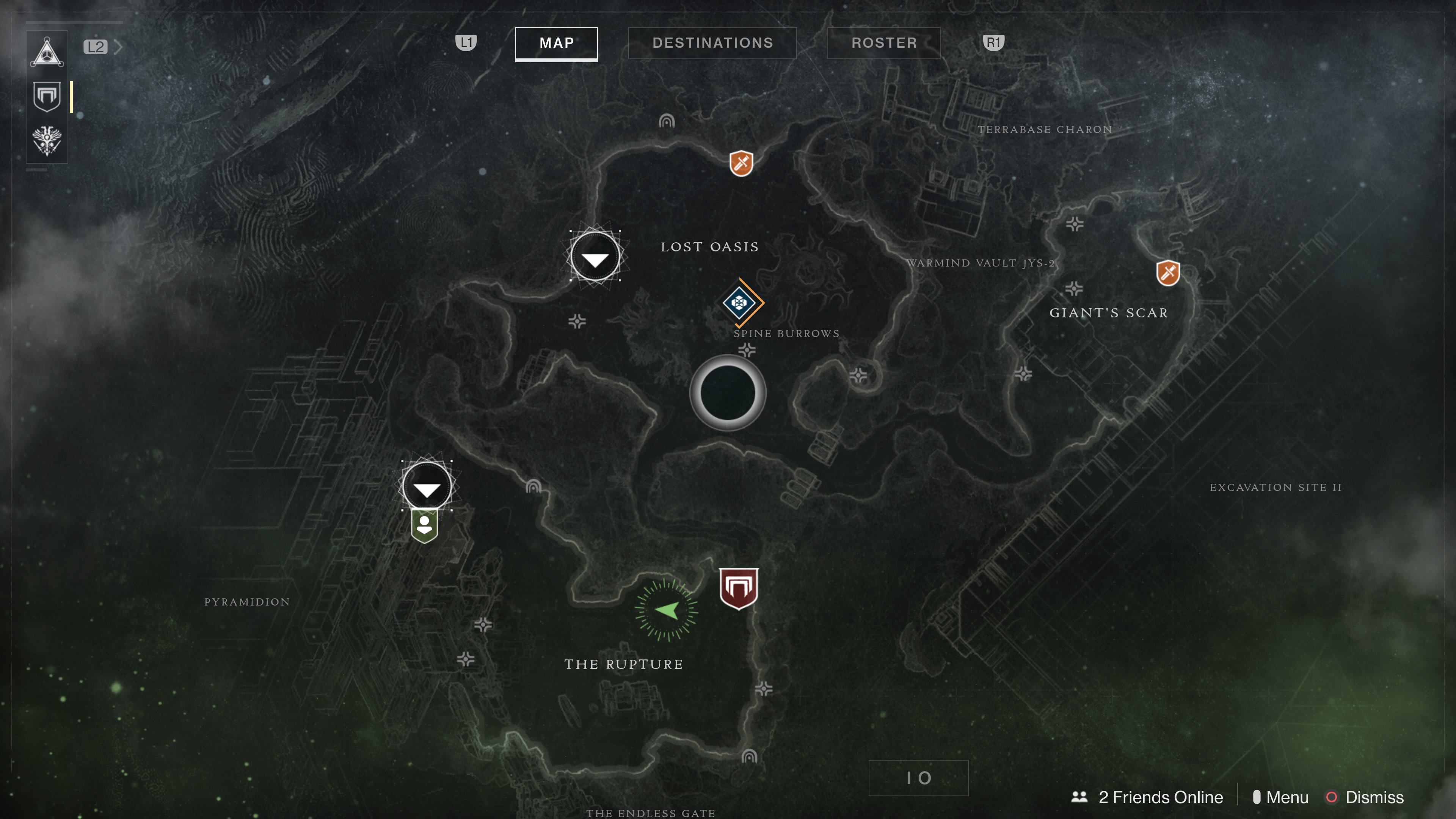
While playing Destiny 2 off and on last week, it occurred to me just how much I appreciate a well-designed game map. In general, I admire a variety of map styles but ones that have clean (uncluttered) design, make use of muted colors, and indicate levels of difficulty in subtle ways interest me the most.
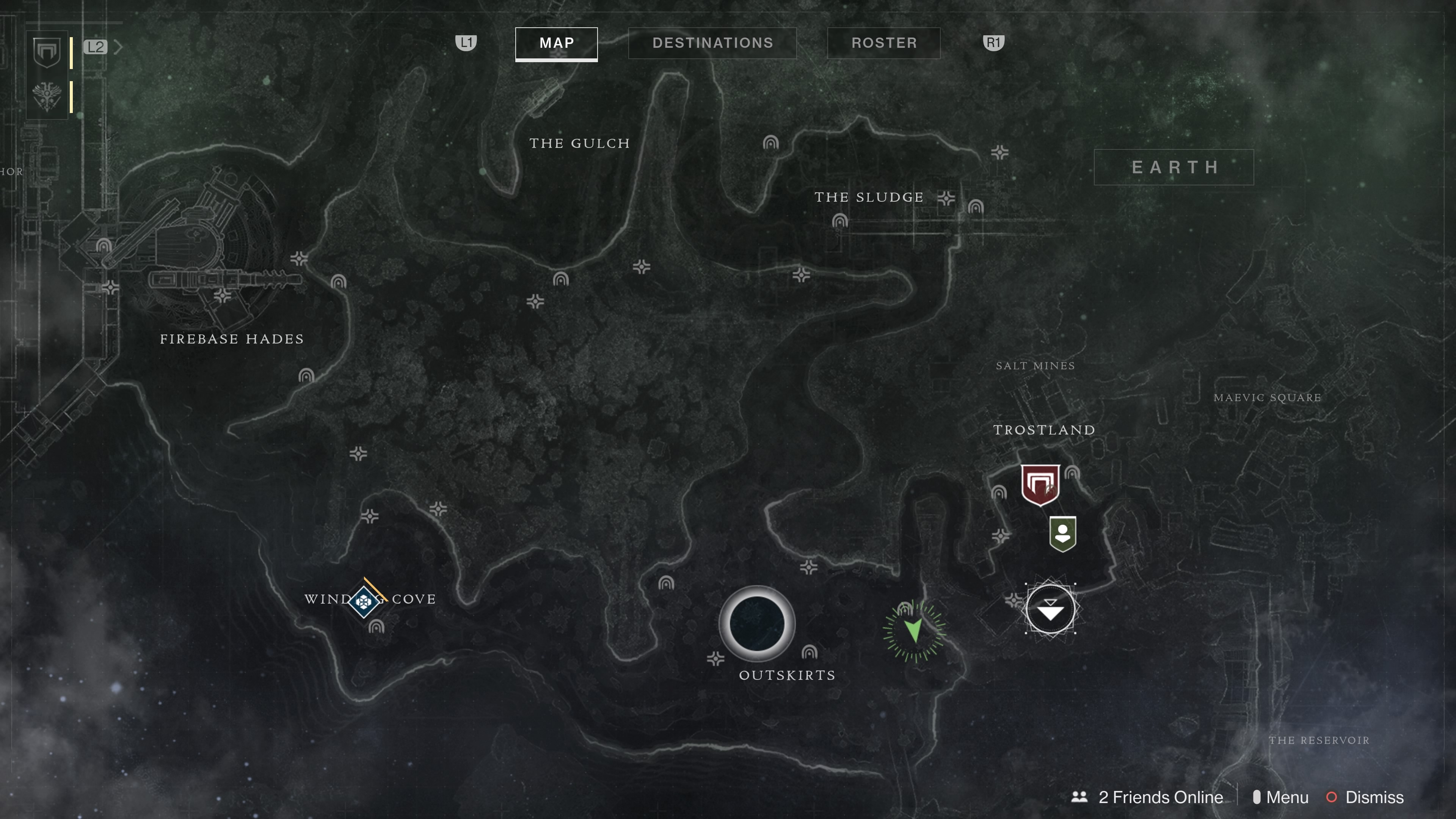
I find Destiny 2’s maps aesthetically pleasing because of the minimalist design, the charcoal hues, and due to the fact that they aren’t littered with icons, a common malady of maps in many games.
But other than pleasing design, do maps really matter?
I think they do in some very significant ways. A game’s map is part of its visual identity, and, in turn, plays a part in how the player gets to know the game (shaping one’s perception of the game). Maps limit where players can go while indicating paths to travel and points of interest. The best maps, in my opinion, don’t shout out all points of interest by way of icons but instead subtly suggest areas worthy of exploration like the broken outline of what could be a structure or a crack amidst mountainous terrain. Engaging maps have something to offer beyond the obvious waypoint.
Maps divided into sections, especially when those sections are “locked” or shrouded in mist, encourage players to explore and constantly seek new locales, to push into the unknown. Some games reveal their maps in near entirety from the very beginning. Either way, a map provides a visual framework of the game’s spaces and limitations.
While I haven’t done much in the way of seeking out scholarship regarding video game map design, I wonder how much game genre shapes map conventions. I might need to investigate that further for a future post.
To wrap this post up, I would like to share a few of my favorite maps and some others I find intriguing. It’s a short post this week because of school and life and blah. But I hope you enjoy the gallery, and, if you feel like dropping a comment, maybe share some of your favorite video game maps!

Leave a comment